Are you a project manager? If yes, then you might be wondering whether to use a Gantt chart or a Burndown chart. Say no more because Takethiscourse gets your thoughts every time. In the Agile world, some project managers find Gantt charts too hard to use, whilst others find it convenient to print out a massive printout of the Gantt chart per week and put it on display during team meetings. Whereas Burndown Charts ruling agile projects, indicate the amount of work that needs to be done to finish the project and how this estimate shifts. Let’s break the ice about Burndown vs Gantt Chart, which are popular in agile organizations to track project progress.
In this blog, we will look at two essential project planning tools- Burndown vs Gantt Chart, as well as their benefits and drawbacks, active comparison, how you use them and eventually debunking the myth of which one is better. Let’s break the ice about Gantt Charts vs Burndown Charts, which are popular in agile organizations to track project progress.
- What exactly is a Burndown chart?
- How to use a Burndown Chart?
- What Exactly Is a Gantt Chart?
- How to use a Gantt Chart?
- Benefits to using a Burndown Chart
- Drawbacks to using a Burndown Chart
- Benefits to using a Gantt Chart
- Drawbacks to using a Gantt Chart
- Choosing the Right Chart for Your Project
- Best Practices and Tips
- Final Thoughts
What exactly is a Burndown Chart?
A burndown chart is less complex than a Gantt chart. Jira is a popular project management platform that delivers these charts. Specifically, project managers employ a burndown chart to create and update the progress of any project instead of being overly descriptive and quickly communicates an aggregate figure. A burndown chart checks two distinct variables to calculate how much time is left on a certain project.
Specifically, the quantity of work required to accomplish the project and the amount of time needed to do the work. The graph then allows you to quickly and easily view the answers to these questions.
How to use a Burndown Chart?
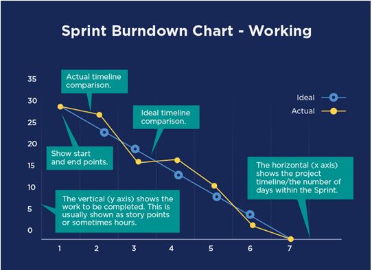 The burndown chart will be an excellent match to some of the other types of performance charts that you might construct. Using this style of bar chart, you can determine whether your project is on pace to be able to hit the deadline or not. The burndown chart shows a pictorial representation of how much work needed to be done when you started, what you’ve done, and what you still need to do. You might also be interested in Project Manager Jobs Market Trends.
As a project manager, you’ll be responsible for totaling figures and plotting them on the Burndown Chart. Then estimate a trend line after numerous plots on the chart. From here you can estimate the project’s expected completion date by drawing such a trend line onto the chart and seeing where it intersects the horizontal axis.

What Exactly Is a Gantt Chart?
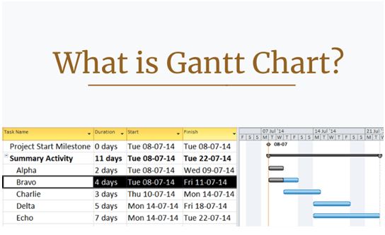
A Gantt chart is a bar chart that depicts the project timelines or tasks that have been scheduled. This graph does more than just monitor task durations and deadlines. As a project management tool, it will aid you in the planning and scheduling of projects of all sizes, simplifying challenging tasks. A Gantt chart allows you to keep track of tasks, dependencies including every completed step, and who is in charge of the effort. Take a look at the example below:
Using Gantt chart software, users can develop a work breakdown structure, schedule tasks for members of the team, watch project performance along the way, or drag & move timelines to rapidly alter your project plan.
How to use a Gantt Chart?
 A Gantt chart’s fundamental premise is to outline which projects can be completed in sequence, that must be completed successively. When you’ll combine this with the available resources, you’ll investigate the trade-off across scope as well as cost and project timelines. To develop a chart, you must first know all of the individual activities that must be completed to finish the project. The project manager may see the impact on the finish date by adding more information or lowering the scope with a primary focus on the critical components.
Benefits to using a Burndown Chart
If you opt to work with burndown charts, you will uncover several advantages. The trick is to ensure you’re utilizing tools correctly and commencing them upfront in your iterations or projects. Let’s dig in:
- Monitor Progress: Among the first factors that you’ll notice about this style of the chart is that the statistics are instantly apparent. You don’t have to look for much of anything, and you don’t have to stare at the chart for a lengthy period. This Burndown Chart instantly communicates an aggregate figure of where the team is in the project by sketching such a trend line onto the chart and seeing where it cuts the horizontal axis. It also demonstrates how accurate the team is in estimating. you can also check out Project Manager Salary Statistics.
- When and how: A burndown chart is an excellent way to keep your project up to date when analyzing complex charts or systems. Because it is simple to learn and understand, and you can read it rapidly as the velocity will be used to estimate the project’s finish date while also demonstrating the team’s ability to execute work. If the project manager notices upslopes in the chart regularly, it indicates that the team’s projections need improvement.
Drawbacks to using a Burndown Chart
There are some fantastic possibilities with burndown charts, though there are a few things you should be aware of. The drawbacks will assist you in determining whether a burndown chart is the best option for your team and projects.
- Required firm planning: Carefully design your sprint in order to gain an accurate picture of how much time and work you have leftover. If you overestimate the sprint, you’ll find it difficult to stay on track. Unlike Gantt Charts, Burndown Charts do not assist a workforce in understanding the interconnectedness between tasks and the impact that prolonging one activity could have on next.
- Overlooks the Backlog: It is your job to enter everything into the chart and ensuring that almost everything runs correctly. For instance, if you do not pay attention to the backlog of tasks or do not timely enter the backlog of tasks, you may likely wind up with an erroneous chart.
Benefits to using a Gantt Chart
When you deal with Gantt charts, you gain a variety of benefits. Simply try to use the indicated tool correctly by implementing them effectively in your projects. Let’s get started
- Display milestones: A Gantt Chart, Microsoft Project’s most common planning software, displays milestones to identify when critical points in the project have been hit. These are typically shown as black diamonds. Gantt Charts are typically created using project management software. By illustrating the tasks to be done, ordering of the tasks, the start, and end date through displaying milestones, Gantt charts show all the key events and how it’s done.
- Leverage and communicate the schedule: A Gantt chart can quickly calculate the impact of changing one aspect of the plan, such as delaying the start of one task or reducing the number of resources, on another aspect of the plan, such as the project’s end date, for clear visuals for stakeholders and participants. This particular chart explains what work needs to be done on a project and which resources are assigned to accomplish each task.
Drawbacks to using a Gantt Chart
There are a few things to look for in addition to wonderful potential with Gantt charts. The drawbacks will help you decide whether a Gantt chart is the safest alternative or not:
- Overly complex: Gantt Charts are extremely hard to use, thus you may choose the Burndown Chart, as it is much easier to use. When there are too many dependencies and activities, it is preferable to create a clear and basic plan that illustrates the essential work packages in simple patterns rather than a plan that is so detailed with minimum impression. While this kind of chart is rapid to come up with and update, Gantt charts lack the detail needed to assist project managers manage and coordinate their activities.
- Less accurate & communicative: Gantt charts illustrate the orbital period of a task but do not convey how many workers may be expected to accomplish it. With plenty of depth into the future in Gantt charts created by project managers, this chart is not feasible as comprehensive forecasts are improbable to be correct. It will result in too elaborate diagrams that will take longer to update and maintain.
Choosing the Right Chart for Your Project
Considerations for selecting the appropriate chart
- Project characteristics and requirements: It requires the assessment of the nature of the project. This usually includes its scope, duration, and complexity. You also need to consider whether the project follows an agile or traditional project management approach.
- Team preferences and familiarity: Here we need to take into account the expertise and familiarity of the project team with different types of charts. We also need to consider their comfort level and understand their ability to interpret and use the chosen chart efficiently.
- Integration with project management tools: This requires evaluating the compatibility of the charting options with our existing project management tools and software. Here we need to determine whether there are any integration capabilities that can streamline the workflow.
Project characteristics and requirements
- Agile projects: It is believed that burndown charts are mostly suited for agile projects. It is because they focus on tracking and managing the work progress even during short iterations or sprints. Burndown charts offer visibility into the remaining work and they also help teams stay on track.
- Traditional projects: In traditional project management, we normally use Gantt charts why because they offer a comprehensive view of project tasks, timelines, and dependencies. Gantt charts are mostly suitable for all those projects that have defined activities and a linear workflow.
Team preferences and familiarity
- Considering the skills and expertise of team members: If your team is experienced in Agile methodologies and comfortable with data-driven tracking then a Burndown chart is always a better fit here. Whereas, if the team is more comfortable or familiar with traditional project management practices and tends to prefer a visual representation of tasks and timelines, then of course a Gantt chart is the preferred choice.
Integration with project management tools
- Assessing the compatibility of the chart options: You can use your project management software to assess the compatibility of the chart options. Here you need to determine whether there are any plugins, extensions, or built-in features that support the creation and maintenance of Burndown or Gantt charts.
- Evaluating the ease of data synchronization: It is believed that seamless integration can not only save time but effort in updating and maintaining the chart as the project progresses. Thus you can evaluate the ease of data synchronization between your project management tool and the selected chart. While making an informed decision, it is very important to consider all these factors collectively.
Best Practices and Tips
Utilizing Burndown Charts
- Defining clear and achievable sprint goals: You need to make sure that your team understands the objectives and scope of each sprint. When your goals are defined clearly, it helps to track and measure the progress more accurately.
- Updating the chart regularly: If you keep the Burndown chart updated then it can offer visibility into the team’s progress and highlight any potential delays or issues on time.
- Using different lines or colors for depicting work items: When you use different colors or lines to differentiate between user stories and other work items, it becomes easier to identify and track different components of the project.
- Tracking and addressing scope changes: By tracing any changes to the project scope and adjusting the chart accordingly, you can ensure that the Burndown chart has reflected the current state of the project efficiently.
Maximizing Gantt Chart’s effectiveness
- Breaking tasks into manageable subtasks: If you divide complex tasks into smaller ones, it becomes easy to track and estimate the progress of the project.
- Clearly defining task dependencies: Identifying and documenting dependencies between tasks can define key milestones of the project and helps in monitoring progress.
- Setting realistic deadlines and milestones: Defining key milestones for the project and establishing realistic deadlines for every task helps in monitoring progress.
General tips for both charts
- Keeping everything simple and concise: When you avoid overcrowding the charts with a lot of information you can focus more on the key elements that are very important for tracking and decision-making.
- Using visual cues and legends: It is useful to incorporate visual cues like color grading or legends as they enhance readability and understanding of the charts.
- Viewing and analyzing the charts regularly: Scheduling periodic reviews of the charts with the project team and stakeholders is very helpful. With that, you should also try to analyze trends regularly and identify areas for improvement.
If you try to follow all these best practices and tips, it will become easier for you to use Burndown and Gantt charts to enhance project visibility and make informed decisions throughout the project lifecycle.
Final Thoughts
Project teams are frequently required to plan tasks and manage resources across diverse projects and teams. As a response, it’s vital to ensure that your Gantt or Burndown charts can support resource utilization, work scheduling, and project planning across programs. Take our suggestion and work in a set time frame with beneficial efforts- the overall start and completion plannings will get you anywhere you want to go.